Summary
I led a team of 2 Product Designers (1 Lead Designer, and 1 Junior), and 1 UX Researcher. Collaborated with 1 engineering manager, 5 engineers, and 2 QA engineers over 3 months. We had 3 objectives to accomplish with this work.
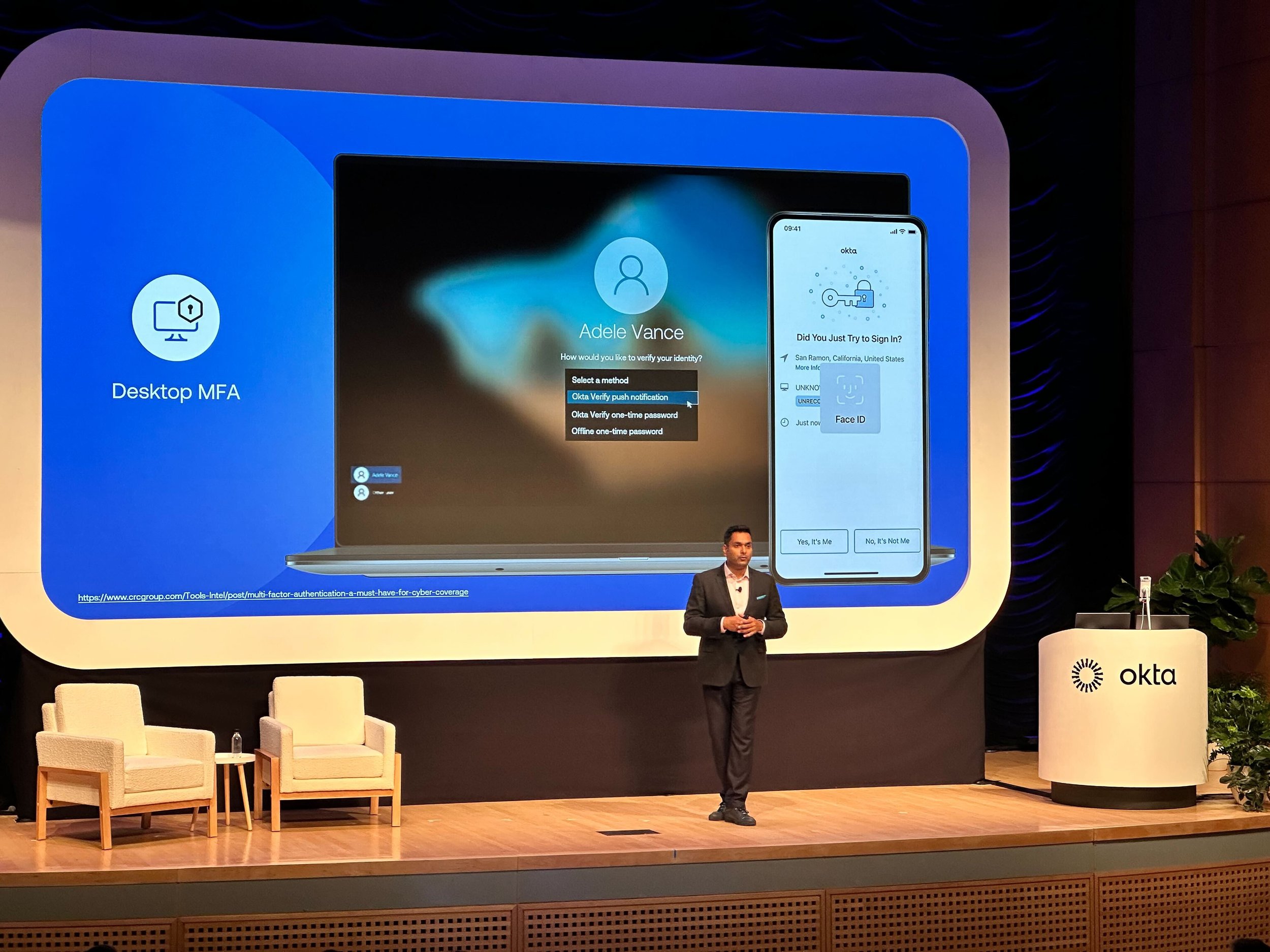
Allow admins to comply with security requirements that devices need to have Multi-Factor Authentication (MFA). Passwords are no longer enough to protect employees logging into their work Mac or PC. These sensitive computers now require Multi-Factor Authentication (MFA) to comply with cybersecurity insurance requirements or follow the Executive Order on Improving the Nation’s Cybersecurity. Computer logins now require a password and a separate factor, such as a one-time code, a push notification, or a security key.
How do we create a seamless experience for users transitioning to this login method when Admins deploy it in their organization?
Users receiving a new device can simply log in and automatically have access to what they need to accomplish their job.
Role: Product Design Manager
Company: Okta
Industry: Customer Identity Platform

The Process:
Constraints and Competitive research:
Following the Windows and macOS interface conventions came with constraints. On Windows login, we were limited to strictly 10 basic UI elements and couldn't include images or customize the login font in any way.
On macOS login, we could use the UI elements of any macOS app, but had to either cover up the username & password fields or emulate the entire login window, down to the colorful background image that varies with each release.
We weren’t the first to market with Desktop MFA. However, each competitor used a custom interface, rather than following Windows or macOS conventions. I advocated for this opportunity to speak to one of Okta’s strengths—vendor neutrality.
Decision: Follow the Windows and macOS interface conventions, because end users will have inherent trust in them more than in any security product.
Prototyping for feasibility:
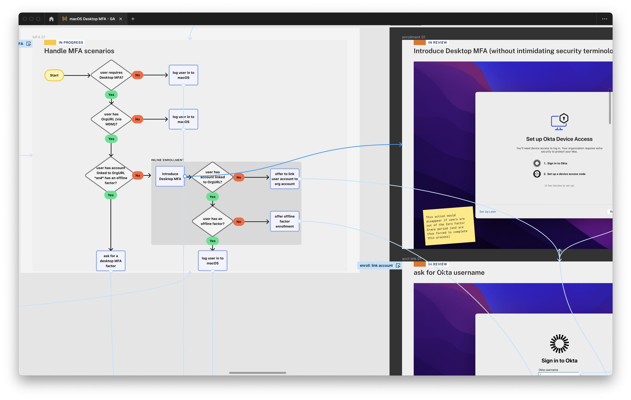
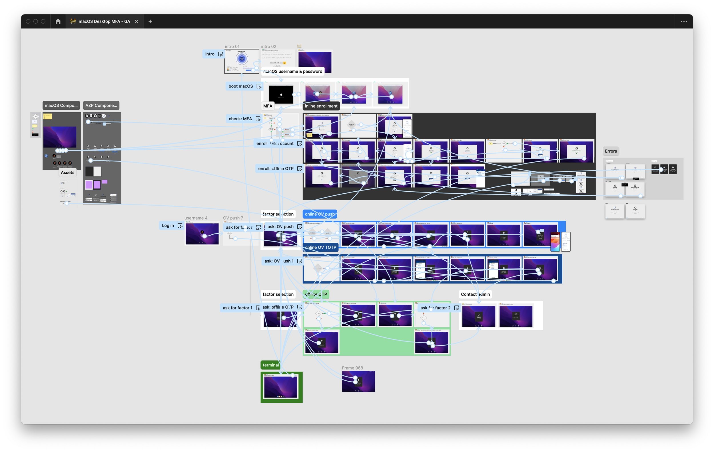
Had the team prototype early in low fidelity to clarify what was possible and needed from our solution.
Prototypes mixed UI with authentication logic; both were fully clickable. Interactive logic was crucial since the prototype shared and informed the code engineering would eventually build.
We presented these prototypes to the team on a weekly basis to confirm feasibility, eliminate unnecessary states, and ensure we delivered UI for every critical path.
Extensive prototyping allowed us to simulate and test a complete user experience before committing to code.
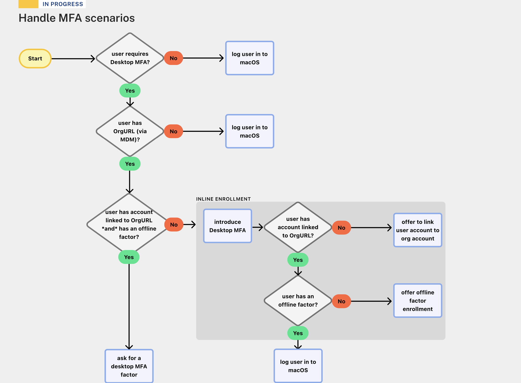
Usability testing for improved enrollment:
Usability testing of our Windows prototype with users found a key challenge. End users had 50 logins to enroll in additional security after being logged in. Not only did users defer enrollment until the count was low, but they expected to enroll when the count reached 0.
Decision: Meet end user expectations and revisit the feasibility of starting with enrollment during login. We wanted to be similar to the macOS Setup interface, which also appears before users are logged in. Something users would already be familiar with.


Outcomes & Market Feedback:
Following the Windows and macOS interface conventions led to interfaces that felt fully integrated into the existing, familiar, trusted login experience. In beta testing, administrators shared comments like "it looks like you partnered with Microsoft [or Apple]".
We generated $1 million ARR in the first 7 weeks after the product announcement in Washington, D.C., and $4 million after 4 months.